

Tuesday, 23 April 2013
Friday, 19 April 2013
Evaluation Part 4
Evaluation Part 4: What Have You Learnt From Audience Feedback?
What praise
and criticism did you receive during the focus group screening?
We had a mix of praise and criticism during the screening
here were some of the positive
feedback:
“The blood effects
work well, especially onto camera.” “Good shots, like the walking scenes of
feet”
“Text was good” “Good soundtrack, it is cut at places really
well” “Great sound effects”
“Sets narrative well” “Love the text/font” “Nice sound
effects” “Good jump shots”
“Good shots – canted angle through mask” “Good location –
creepy”
“Nice blood FX” “Good violent scenes” “The gore and the
effects” “I like the inter-titles on the background of the mask”
“Jump scare at the end was sick” “Great gore effects” “Good
blood effects, good camera angles”
“The end was really effective, and the sound effect went
really well with that part” “Spitting on the screen was cool” “Really good
pace” “Good camera angles”
“Nice shots” “Good lighting” “Lots of angles” “Good blood
shots” “Good gore effects, jumpy, good titles & text” “Gore & close
ups”
And here is some of the negative
feedback:
“The audio of speech isn’t very clear and is hard to
understand” “Music was louder than speaking sometimes” “Shots could be darker”
“Almost exposes too much of storyline – we see all the characters get killed”
“Hard to hear
talking” “Soundtrack wasn’t horror enough” “Very action oriented” “The lighting
and the music, music did not go with the dialogue”
“Narrative isn’t too clear” “Music was a bit too loud at the
start” “The music didn’t make me feel scared, and it could be more mysterious”
“Not very eerie because the lighting is very high key”
“Can’t hear some of the dialogue” “Couldn’t hear the voices – sound too loud”
“Soundtrack didn’t really fit the horror” “Didn’t like the
music, was too loud fort speech” “Picture was a bit bright, just didn’t seem
scary”
“Speech wasn’t clear”
Here are my comments
on this after talking to my group:
We agreed with the speech being hard to hear so we decided
to change it so the voices where louder than before. We also used the ‘pen’
tool to make the soundtrack quieter at certain points, especially when Aaron
and me discuss whether the story of the killings are true.
We also changed the lighting of the trailer so it wasnot so high key. By using the
contrast/brightness filter on Premier we made it a lot darker and more eerie.
However we disagreed with the music not being suitable
because we thought it suited the action horror style we were going for and
reminded of soundtracks that were similar in horror films like ‘Resident Evil’
and ‘Dawn of the Dead’ (2004).
In addition we also disagreed with it exposing too much
storyline because we don’t show the order of the deaths as they may be in the
full film. It’s clear that two of the teenagers have survived and this would
encourage the viewers to watch the film to see what they are like.
What last minute
changes did you make because of the focus group screening?
We changed the order of events in the trailer to keep the
deaths until further in. This meant we could build the tension more. We also changed so the shot were low key and
lot darker, which also made it more dramatic and similar to the ‘visual mix’ of
real horror films and trailers.

We also added a few additional shots after a reshoot. These
were mostly of Ryan with the mask on, as we wanted to make him the main selling
point of the film just like in ‘Halloween’ and ‘Nightmare on Elm Street


We also took out shots we felt slowed down the narrative in
the trailer and finally added the YOU WILL BE REAPED TEXT which was similar to
the text used at the end of the MARTYRS trailer.
Are you have happy with the final trailer?
I definitely think ‘Harvest on Crepsley Hill’ appeals to our
main target audience and our audience research in class showed this idea would
appeal to our target audience of teenage action horror fans. It has a good pace
and has interesting villain that hasn’t been done as much as other student
films. Also it has really great sound track that befits the trailer and the
genre and finally the main cast are about the same age as the target audience
and so people can relate.
Evaulation Part 3
Evaluation Part 3
How did you use media
technology for your research and planning?
In the initial research we used many technologies such as
YouTube.com for trailers and clips from example for the past and modern
examples. Three of the trailers we watched were ‘Evil Dead’ (2013), ‘The Toxic
Avenger’ (1984), ‘Cloverfield’ (2008) as well as many more. Also we used
DVD/Blu-Ray for the full screening of ‘Dawn of the Dead’ (1979), ‘Dawn of the
Dead’ (2004) and ‘Psycho’ (1960) as well as special features from other DVD to
help us understand the horror genre. An excellent example of this were the
documentaries ‘Document of the Dead’ and ‘The Dead Will Walk’ on the ‘Dawn of
the Dead: Ultimate Collection’ (which really helped us understand horror
effects) as well as the documentary ‘The American Nightmare’ on the old ‘Hills
Have Eyes’ 2-disc set.
Furthermore with our research we also used IMDB for getting dates, directors and stars. It also helped me find out about more horror films that would be helpful to watch, especially ones made by auteurs I liked such as George Romero and Zak Snyder.
For the planning we used general text editing software such
as Microsoft Word and Publisher for our shot list, Prop list, Health and
Safety. Finally for our mood board we used the internet to get the images for
our mood board and then used Photoshop to arrange the images in a tidy way.
How did you use media
technology for your construction phase?
The images below are the Photoshop files for my ancillary products. As you can see in the images, there was a total of 18 layers for my poster and 29 layers for my magazine cover. This shows the amount of complex hard work that went into them.


In our construction phase, we mainly used Premiere Pro. We
uploaded our shots from the HD camera and then edited them using in and out
points (with the “I” and “o” buttons on the keyboard). We also made the
contrast higher using the contrast/brightness filter to give a darker look.
Then we used ‘After Effects’ and the ‘emerge’ filter to make it seem like the
text was growing from the background. Against the textured background like the
killer’s mask, it gave a rough but professional feel.


How did you use media
technologies on the evaluation?
We used a Camera recorder to record the reactions to both
the rough cut, and this led us to change a lot of a product. We added in more
text at the end (YOU WILL BE REAPED) and also cut a lot of shots such as the
girl and boy being pulled into the woods. Our final trailer was much shorter
and more exciting because of this, so filming the reaction to the rough cut
(‘focus group’) was very useful.
We also used Blogger to upload our evaluation and this meant
we could not lose anything. It was annoying when I didn’t have access to the
website when there were internet problems but generally it was very useful.
Monday, 15 April 2013
Thursday, 28 March 2013
Evaluation Part 2
Question 2: How effective is the combination of your main product and your ancillary text?
What key aspects did you include in your poster?
One thing in my poster I decide to do is to make it a stylised cartoon feel because I wanted my poster to be fresh and unique as opposed to the standard movie poster. The poster that inspired mine was "Dawn of the Dead" (1978) with its cartoon style approach to the movie it was based on. With this style it would appeal to the large fan base of people who like comic books.

This was a similar style used in “The Hills Have Eyes” poster which had a hand against a woman’s face but you don’t see the attacker and find out how or what he is.

What key aspects did you include in your magazine cover?
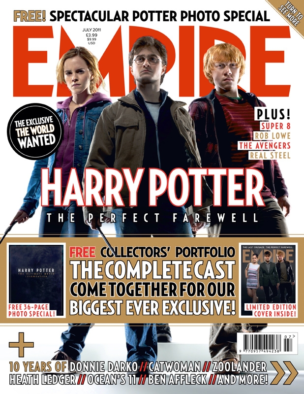
In my magazine however I decide to go for a different approach, to with having one of the star of the trailer appear on the cover as opposed to having the villain because I wanted to keep him a mystery and not have a massive picture of him. As shown in Empire standard magazine with showing actor/director not the character as shown below My magazine I designed is for “Empire” magazine because I felt that they would be the most likely to have an article for this type of mainstream action horror film. This also allowed me to use Empire colourful and eye-catching style to easily construct my magazine cover.
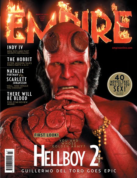
One thing I decided to do for the magazine was to make it more horror like so I made it a horror issue of the magazine. This gave me even more freedom, this time to make it more creepy and dark and allowed us to achieve certain effects horror conventions. One of these was the blood drips from the words EMPIRE to make it more horror like for blood and guts. A similar bit of editing was used on the "Hellboy" cover below where they have added flames.
My choice of fonts was important because they are generally a big part of gory horror like "Harvest on Crepsley Hill". Secondly I decided to change the text into a purple/blue colour to make the magazine feel horror like for that colour connotes coldness and ice which. In our trailer has for in there are many shots there is of snow on the ground and so the cover really relates to the trailer.
How did the ancillary products and the main product work together?
I wanted to get the gory and slightly cartoonish feel of the "Harvest on Crepsley Hill" trailer across in my ancillary products and I feel I have done this well for the reasons I've already written about. All of my products work together to "sell" the main villain of the film (the Scarecrow) along with the auteurs that made it. Combined together I think all three products would sell the narrative and quality of "Harvest on Crepsley Hill" very well.
Evaluation part 1
Evaluation Question 1: In what ways does your media product compare to real life films?
How did your horror trailer fit the horror genre?We had many conventions of horror in our trailer, and the importance of this was written about by Thomas Schatz in his book "Hollywood Genres" (1981) which he says is important in determining films into categories to make them easy to define as one type of film.

Furthermore, we have point of view shots in the trailer with the attacker looking down on a victim and a reverse shot eye line match of the victim looking up at the attacker. This is a good shot for it makes the audience feel like predator then makes them the prey and a change of emotions between the audiences. This is used in "Psycho" (1960), when Arbogast enters the Bates’ household, the first shot when Arbogast opens the door and looks into the hallway is a POV shot. In addition, we have a low key lighting shot when one of the kills happens in a bush. This is a really interesting shot because it makes the Scarecrow appear in a silhouette which is really effective and adds to the Scarecrow’s menace because darkness connotes evil, death and mystery because we cannot see his facial features with only a splat of red on his mask revealing his location. Finally, Body Horror was extremely important in the trailer for it gives a feel for the film itself. With all the gore included in the trailer including the spit on the camera and the knife to Aaron’s neck gives the feeling of a gore but the quick sequence of shots means it has the pace of an action horror.
How did your horror trailer fit the conventions of trailers?
Our trailer had a slow build up to explain the story and set the scene and then have faster shots towards the end to build up the action to the trailer. We decided to make a highlights trailer because we didn’t want show a scene of the movie because it would be difficult to find a scene that would be suitable and would be exciting enough to get the audience excited. There were many trailers that inspired us some examples of this where "Evil Dead" (2013) and "Texas Chainsaw Massacre" (2013) for their style and effects they used and the order of events in those highlight trailers used in ours. Also the fact the trailer was a highlight and not a scene trailer is the pace needs to fast to reflect modern day action horror trailers example of an action horror. An example of this is "REC" (2007) and this trailer has a lot of fast montages similar to ours.
A highlights trailer also gave us the freedom to shoot inserting shots without being shackled with a slow and possibly boring scene with an exciting bit in at the end. It also allowed a lot more creativity with the trailer as we didn’t have to worry about continuity in the trailer just as long as it makes sense. If the character dies early in the trailer, they shouldn’t appear for the rest of the trailer.
What auteur influence did you bring to your trailer?
Our trailer was to follow the style of the modern horror, a fast action horror with quick shot transitions and action paced music. However we also wanted to have body horror to be a big part of the trailer so we decided to have a little of older gory horrors in our trailer like George Romero did in "Dawn of the Dead" (1978) when the bikers are being killed by the zombies it doesn’t hold back on the gore and shows all the guts and blood.
Also in our trailer we wanted to have silhouettes of the added menace/mystery of the scarecrow and it is used twice in the trailer to good effect. We also wanted a lot of scares with the action so we had a calm scene following a violent death and so forth, creating the effect of collision cutting. This is in new remake of "Dawn of the Dead" (2004) in the scene where they are in the car park and are running away from the zombies and it cut to them in a calm elevator with them just standing still.
Subscribe to:
Comments (Atom)