Question 2: How effective is the combination of your main product and your ancillary text?
What key aspects did you include in your poster?
One thing in my poster I decide to do is to make it a stylised cartoon feel because I wanted my poster to be fresh and unique as opposed to the standard movie poster. The poster that inspired mine was "Dawn of the Dead" (1978) with its cartoon style approach to the movie it was based on. With this style it would appeal to the large fan base of people who like comic books.
Another aspect include in my poster was this mysterious silhouette of the main antagonist of the movie. I used this because it gets people to see the movie just to see who the mysterious figure is.
This was a similar style used in “The Hills Have Eyes” poster which had a hand against a woman’s face but you don’t see the attacker and find out how or what he is.
What key aspects did you include in your magazine cover?
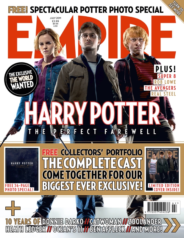
In my magazine however I decide to go for a different approach, to with having one of the star of the trailer appear on the cover as opposed to having the villain because I wanted to keep him a mystery and not have a massive picture of him. As shown in Empire standard magazine with showing actor/director not the character as shown below My magazine I designed is for “Empire” magazine because I felt that they would be the most likely to have an article for this type of mainstream action horror film. This also allowed me to use Empire colourful and eye-catching style to easily construct my magazine cover.

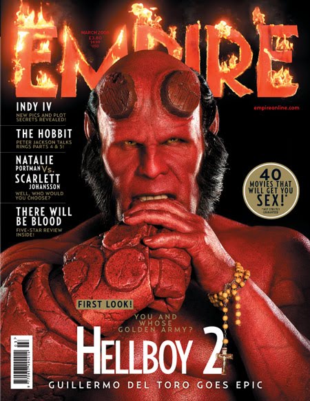
One thing I decided to do for the magazine was to make it more horror like so I made it a horror issue of the magazine. This gave me even more freedom, this time to make it more creepy and dark and allowed us to achieve certain effects horror conventions. One of these was the blood drips from the words EMPIRE to make it more horror like for blood and guts. A similar bit of editing was used on the "Hellboy" cover below where they have added flames.

My choice of fonts was important because they are generally a big part of gory horror like "Harvest on Crepsley Hill". Secondly I decided to change the text into a purple/blue colour to make the magazine feel horror like for that colour connotes coldness and ice which. In our trailer has for in there are many shots there is of snow on the ground and so the cover really relates to the trailer.
How did the ancillary products and the main product work together?
I wanted to get the gory and slightly cartoonish feel of the "Harvest on Crepsley Hill" trailer across in my ancillary products and I feel I have done this well for the reasons I've already written about. All of my products work together to "sell" the main villain of the film (the Scarecrow) along with the auteurs that made it. Combined together I think all three products would sell the narrative and quality of "Harvest on Crepsley Hill" very well.


No comments:
Post a Comment